I partnered with The Handiest of Men, a handyman service company based in New Jersey, to redesign their logo and website.
Background
- Project Duration: 2.5 weeks/76 hours
- Role: UX/UI Designer, UX Researcher, Brand Designer
- Tools: Figma, Adobe Illustrator
- Stakeholder: The Handiest of Men, a handyman service company based in New Jersey
The Handiest of Men is a local handyman services company in the tri-state area of NY, NJ & CT. They provide a range of home improvement and maintenance services to businesses and individuals. THoM brings 15 years of customer service and it is the core of their community driven company.
Brief
THoM is a new company and hasn’t fully built out it’s website yet. They’re looking make their estimate process intuitive and interactive. Additionally, they're want to refresh their logo and clearly communicate their mission and the services they offer to the public.
Process
Research
Information Architecture
Interaction Design
Brand Design
UI Design
User Testing
Summary
Research
Research: I conducted a competitive analysis to identify competitors in the market. I also researched what the general public's opinion is on hiring professionals to do work on their homes. I was able to see what people think about hiring contractors versus a handyman or the DIY route. Being that I'm not a homeowner, I was interested in seeing what the responses would be. I learned a lot about what the process of getting work done on your home.
Interviews:
Participants:
- Participant 1: Female, 79, Medical Transcriptionist
- Participant 2: Male, 53, Business Owner
- Participant 3: Male, 31, Technical Support Specialist
I really enjoyed performing interviews with current homeowners to learn about their experiences with working with professionals working on their homes. I discovered some of their motivations and frustrations with hiring professionals. The goal of the questions were to learn what service they employed, whether it was an enjoyable experience or not and why. I was surprised to learn that 66% of my interviewees hired a contractor, a handyman and DIY'd for various projects on their home. These feedback helped me lay the foundation for what specific problem I would be solving.
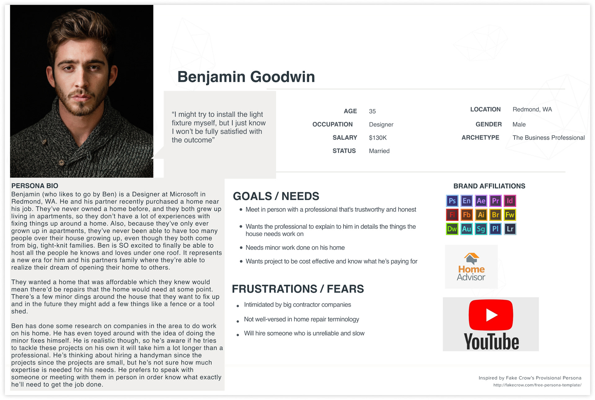
User Persona: The persona you see below was created with the feedback from the interviews in mind. At the end of the day Benjamin is really looking to save money, receive quality work and work with someone who he can trust and build a lasting relationship with.
Empathy Map: This map helped me make the day to day actions of my user persona more specific which allowed me to in more detail about how I would simplify his home repair journey.

Information Architecture
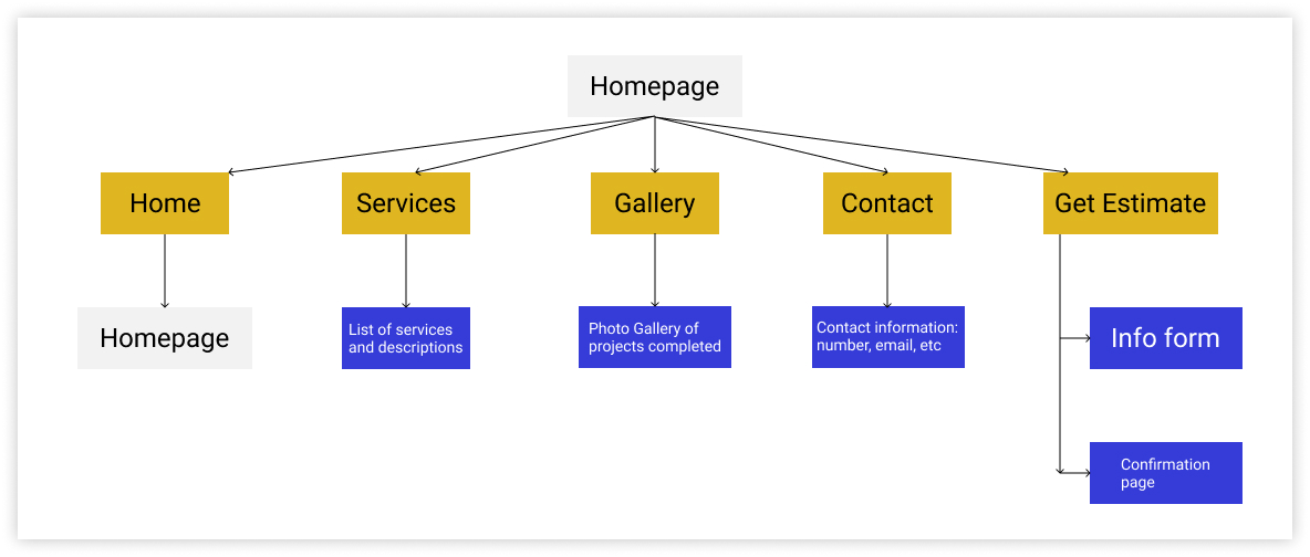
Sitemap: I used my research findings to create the sitemap. This was based on responses from interviewees and current trends that I observed on websites from different industries. I organized the pages in a logical manner.
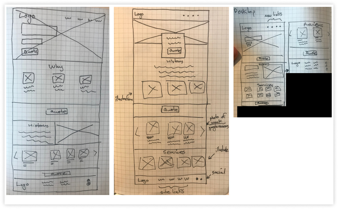
Sketches: I created sketches of the homepage layout and thought of ways to display the content based on the feedback I received during interviews. The process was challenging due to having many ideas on how to display the information in a logical way. Focusing on the feedback during interviews and hearing what people were looking for in a handyman helped me maintain a recognizable layout for the website so as not to distract from the content that would promote the THoM brand.
Interaction Design
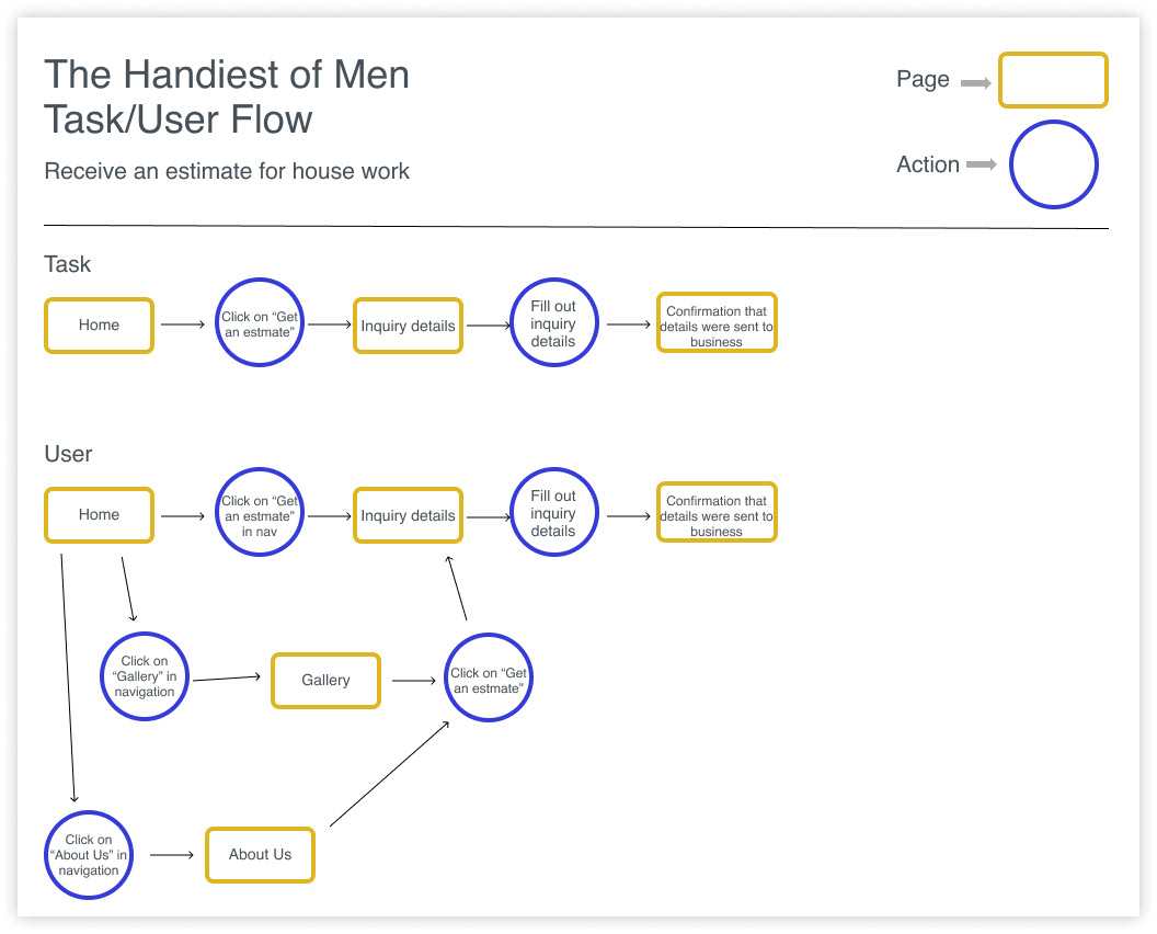
User & Task Flows: I created engaging flows based on researched logical behaviors of the user. These interactions came through thoughtful consideration of current user flows on different ecommerce websites and research findings.
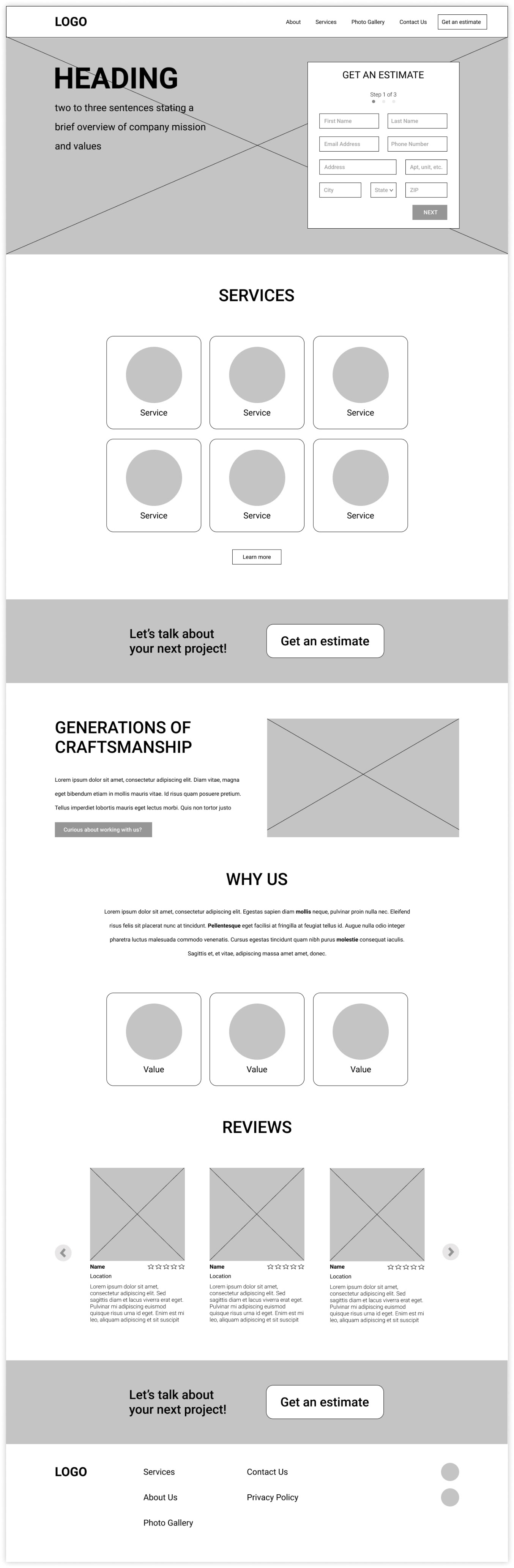
Responsive Wireframes: I created these wireframes after reviewing my sketches and user flows. These would set me up by having a foundational structure for the rest of the website.
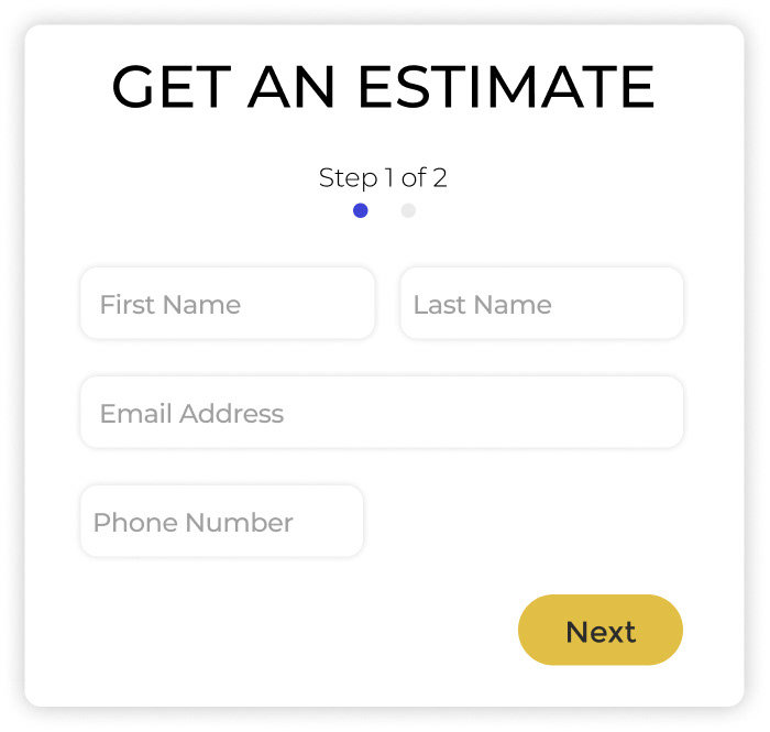
Lo-fi Prototype: Then came the time to test the functionality of what I had created. I made a prototype that outlined the process of what would be one of the main functions of the site which is filling out a form to receive an estimate for work to be done on the user's home.
Brand Design
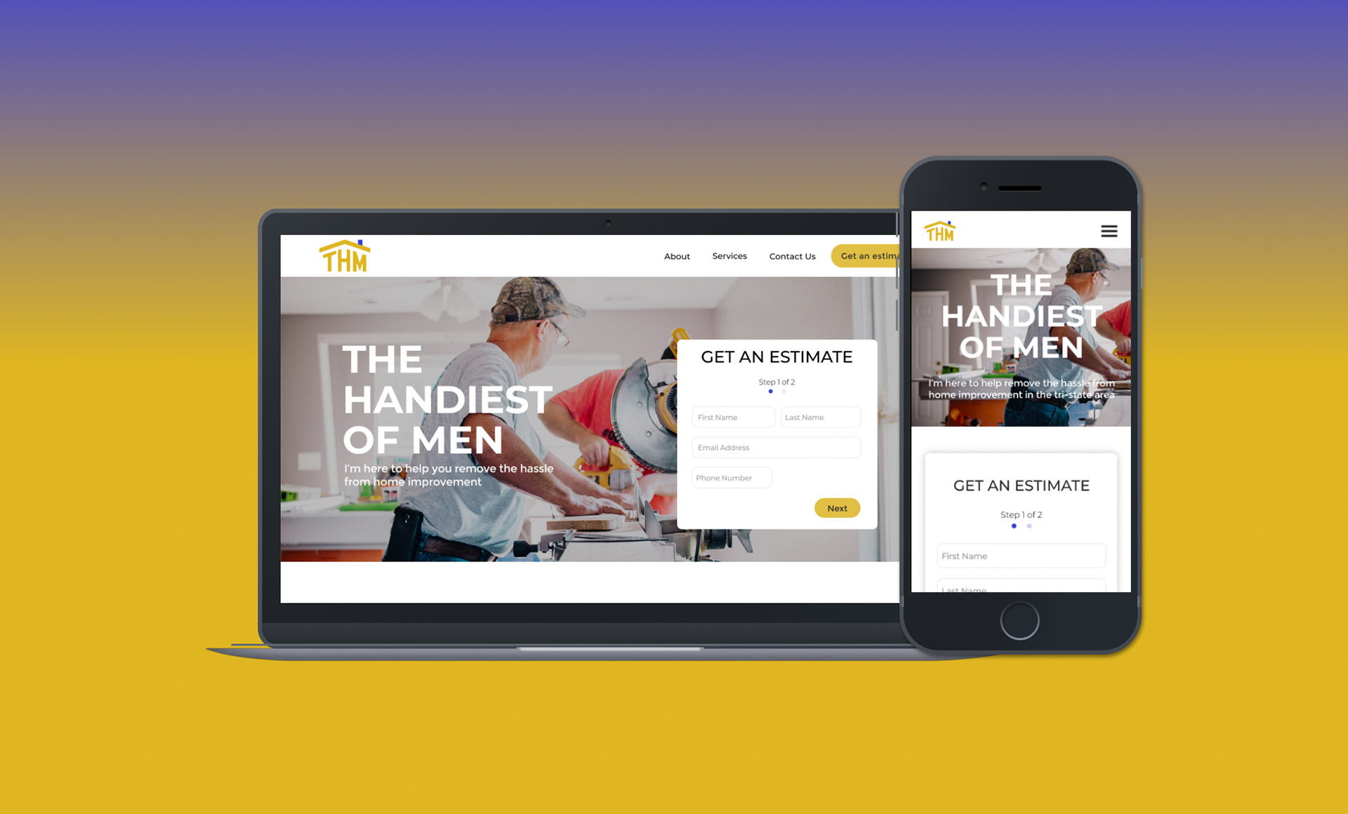
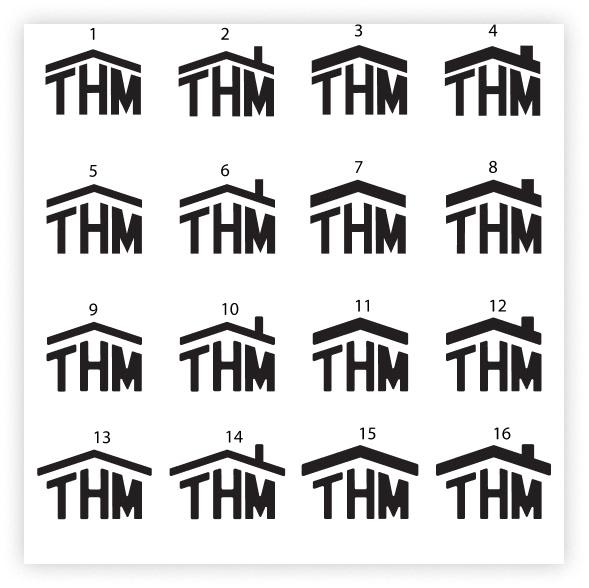
Logo: THoM had an existing logo that I was tasked with reinventing. The challenge was creating a logo that was visually resolved and creative, while at the same time making the brand recognizable. The name is too long to include in the logo. The solution I came up with was making a symbol and text based logo. The acronym represents the name of the company but also forms into the shape of a house which symbolizes the industry the company finds itself in. The colors I chose represent trustworthiness, security and being approachable which are in line with the mission of THoM.
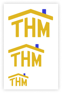
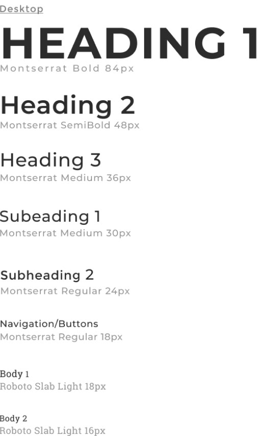
UI Kit: When creating the elements for the UI Kit, I kept in mind the user and tried to empathize with them. I wanted the site to remain approachable, trustworthy and intuitive. The blue sprinkled throughout the site provides a sense of trustworthiness and security to our users. The yellow is for approachability which is what THoM prides itself on. The ability to empathize with their customers is of utmost importance.

Logo
Color Palette


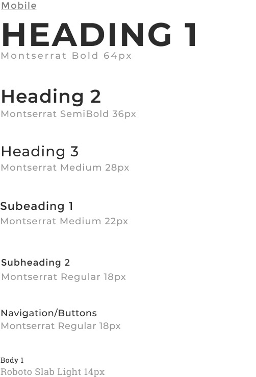
Typography
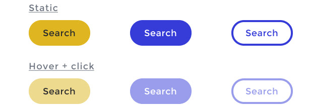
Buttons
Icons

UI Elements
UI Design
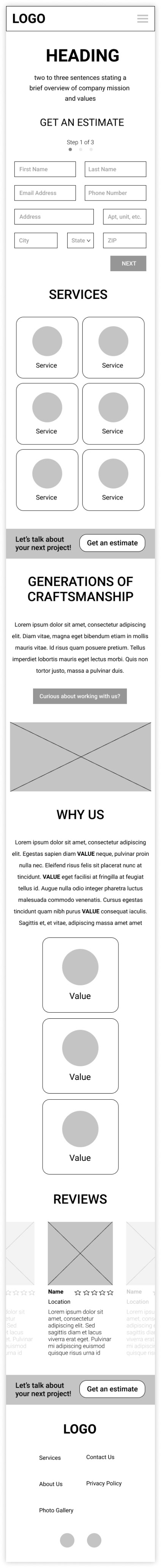
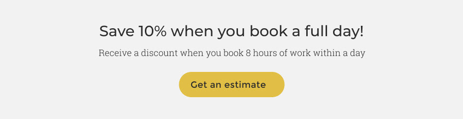
Responsive Designs: I took all the components from the UI Kit and created desktop and mobile designs for the company website.


Usability Testing
Hi-fi Prototype: I conducted a user test with a hi-fi prototype I created based on feedback from the lo-fi prototype and the responsive homepage designs
Desktop Prototype
User Tests: These tests gave me great insight into how usable the product is. Using the hi-fi prototypes, I wanted users to complete two separate tasks. I explained each task to them, observed their interactions with the product and asked follow up questions to gain further insight.
Participants:
- Tuilly, 29, Technical Product Manager
- Gina, 52, Nanny
- Sasha, 28, Program Manager
Tasks:
- Start on the Homepage, begin and finish the process for getting an estimate to get work done on your home
- Go to services page, look through what they offer, then find your way back to the homepage
Summary: The testers gave insightful feedback which led to the solving for a more cohesive visual experience for filling out the estimate form. There was dislike around the introductory copy on the homepage not having an image that it's accompanied by.
Summary
This project was challenging!
My greatest challenge was managing my time and balancing my desire to stick to the timeline I created for myself while at the same time creating deliverables, the logo in particular, that were to the liking and standards of the client. The key was to communicate effectively and create mockups for the client to see how the logo, in it's different stages of creation, would be utilized on the website.
Were I to continue working on this, I would work with the business owner to monitor the success of the site and make improvements based on feedback form his users. One feature I would want to add is an account feature. This will create customer loyalty and more interactions between users and the business owner.