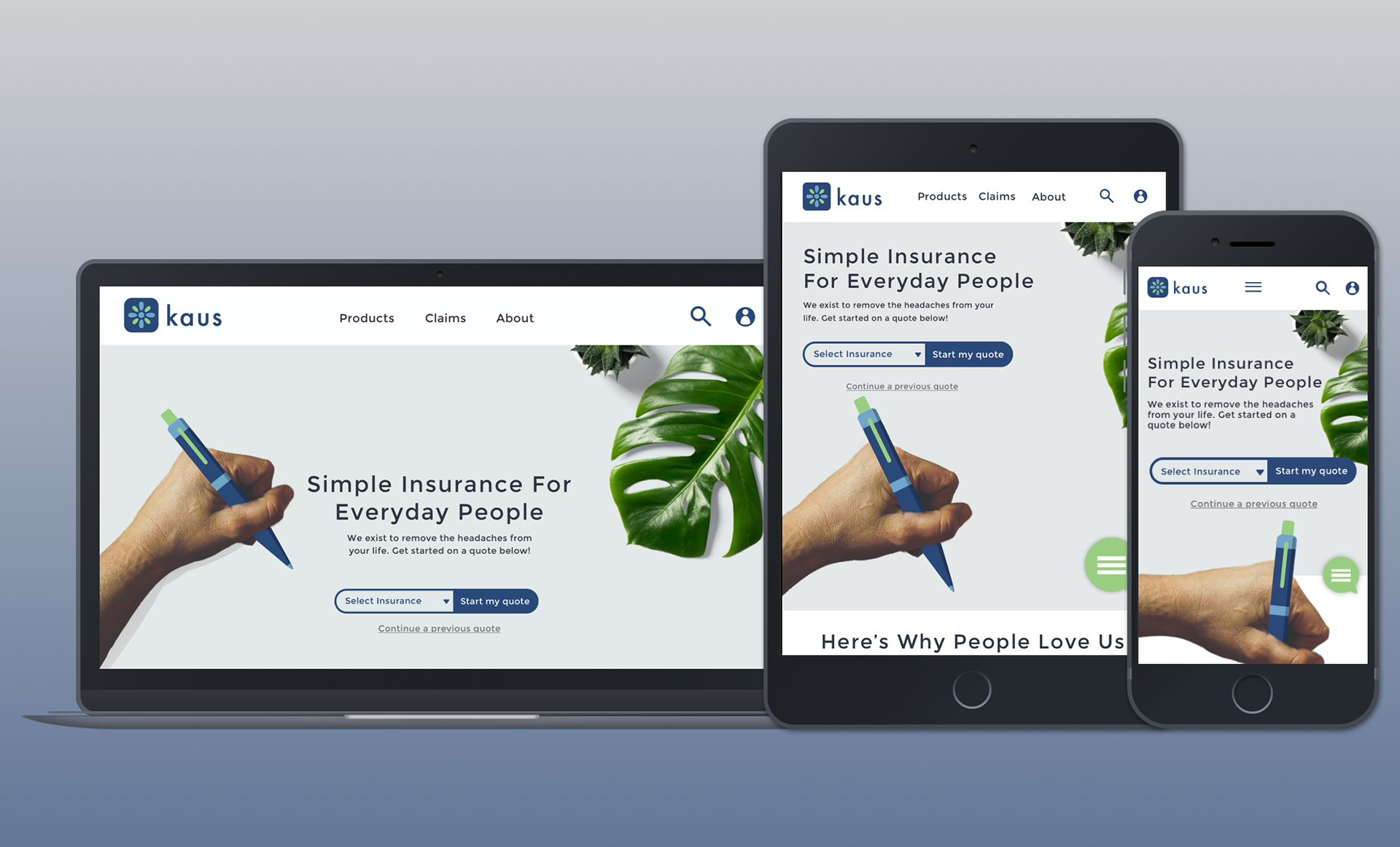
Redesign of insurance company's online presence. Fully responsive sites created for Kaus.
Background
- Project Duration: 7 weeks/126 hours
- Role: UX/UI Designer and researcher
- Role: Sketch, Adobe Illustrator
- Stakeholder: Kaus Insurance (fictional insurance company created by DesignLab)
Kaus has been in the business for over 30 years. They have been working through regional agents, selling the policies to them instead of directly to customers.
Brief
Kaus wants to create a responsive ecommerce website that appeals to the younger tech savvy generation. They also want their overall brand and logo to have a fresh look that appeals to a much wider audience.
Process
Research
Information Architecture
Interaction Design
UI Design
Iteration and Implementation
Summary
Research
Research: I conducted a competitive analysis to identify competitors in the market and current buying trends, what people are not buying and why. I also did research on what industry standards are when it comes to how insurance companies operate.
Interviews:
Participants:
- Participant 1: Male, 32, Married, 2 children
- Participant 2: Female, 28, Married
- Participant 3: Male, 33, Single
- Participant 4: Female, 30, Domestic Partnership
I performed interviews with potential users and discovered some of their motivations and pain points when buying insurance. The purpose of the questions I asked was to get to the root of what's people's perception of insurance is and how they would describe their relationship with insurance. I was surprised to have 75% of my interviewees describe their understanding of the term "insurance" with negative adjectives. These perspectives really helped me build the persona and in turn build a foundation to stand on for the rest of the project.
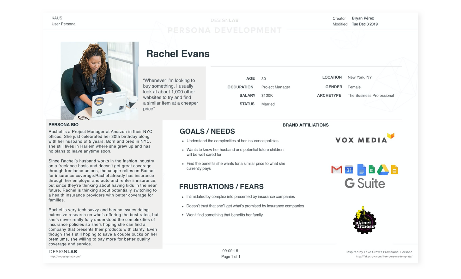
User Persona: The persona you see below was created in an effort to maintain the humanity of Kaus' potential users. The interviews really helped form this persona, and when moving forward in the process, Rachel helped me keep in mind who I was designing this product for.
Storyboard/Empathy Map: These tools helped me bolster the needs and user journey for my persona.

Information Architecture
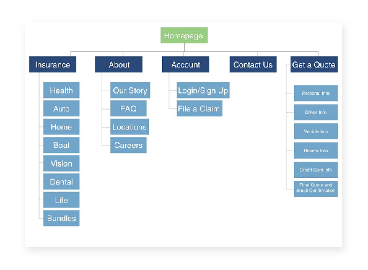
Sitemap: I used my research findings to create the sitemap. This was based on responses from interviewees and current trends that I observed on insurance websites.
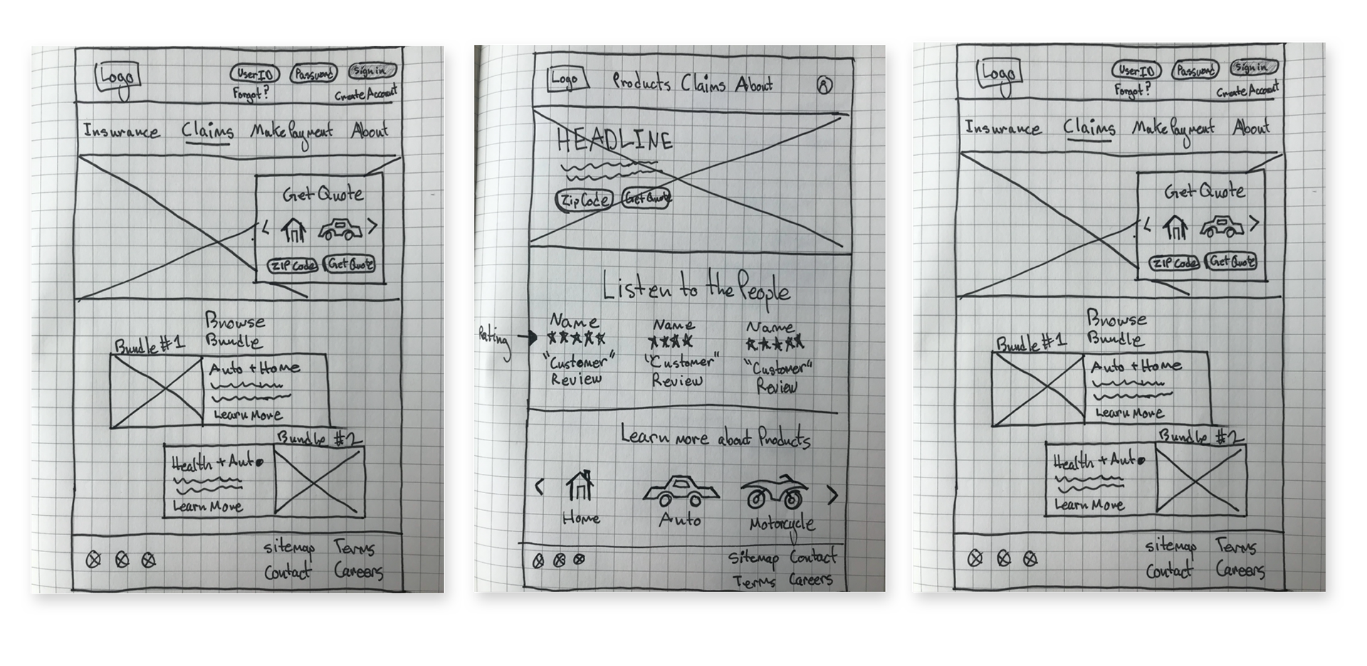
Lo-fi Sketches: I made various sketches for the homepage layout and tried to think of different ways of displaying the content based on the feedback I received during interviews. This process was difficult because I had a lot of creative ideas of how to display the content but I kept in mind the particular audience I was addressing and Kaus' goal of making the content easily digestible. This helped me stick with three sketches and then moving forward iterating on them.
Interaction Design
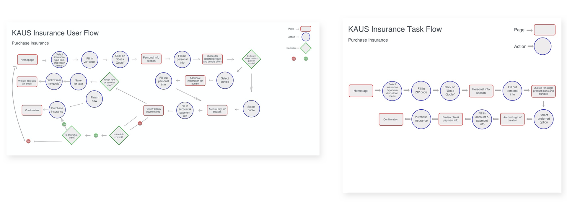
User and Task Flow: I created engaging user flows based on researched logical behaviors of the user. These interactions came through thoughtful consideration of current user flows on different ecommerce websites and research findings.
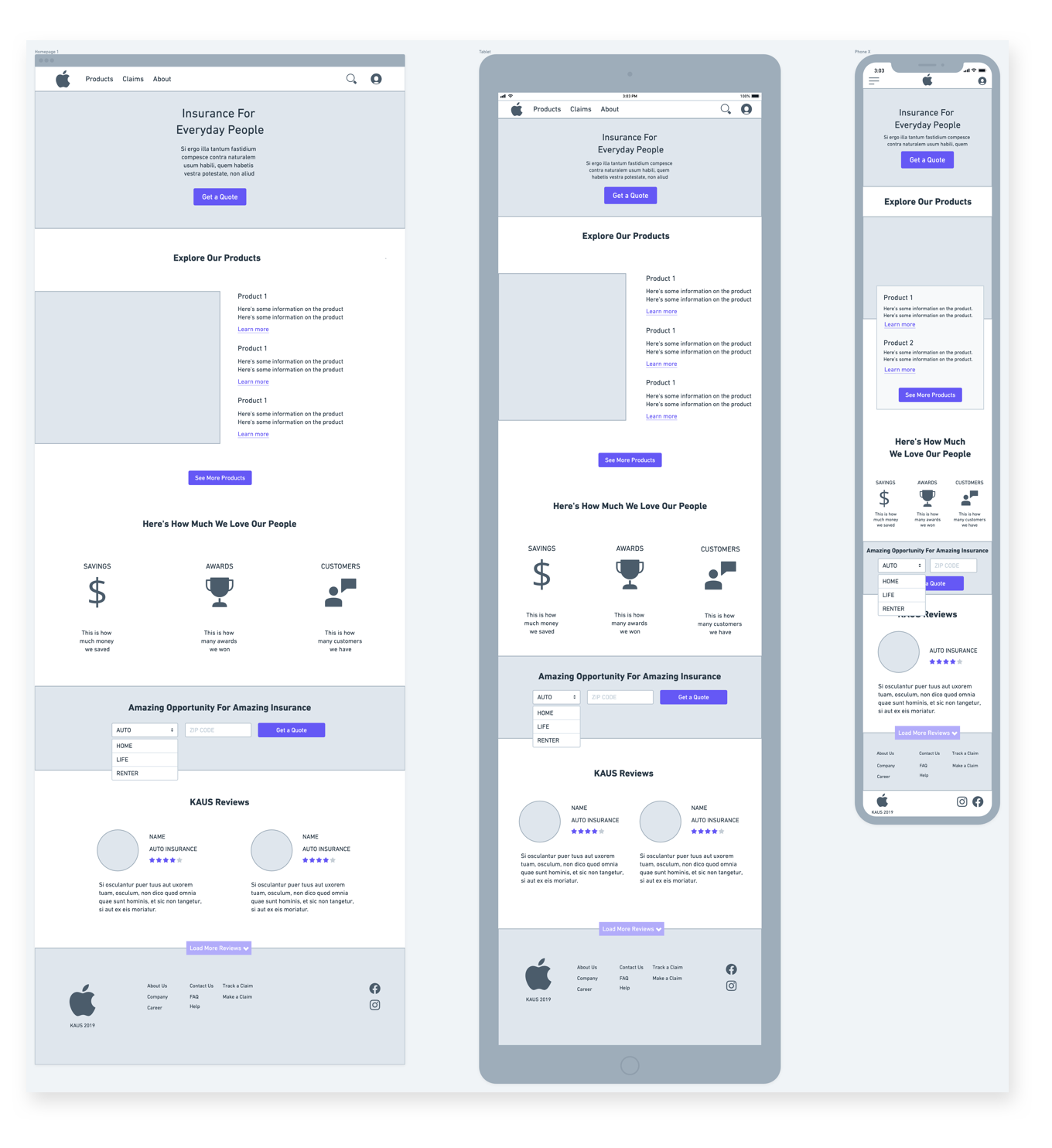
Responsive Wireframes: After studying the user flows I created as well as looking over my wireframe sketches, I finalized the layout direction I landed on and created responsive versions of my sketches.
Lo-fi Prototype: Once the responsive wireframes were done, I wanted to test the functionality of what I had created. I made a prototype that outlined the process of what would be one of the main functions of the site, purchasing insurance. This would allow me to see the intuitive potential of the site given the layout I chose.
UI Design
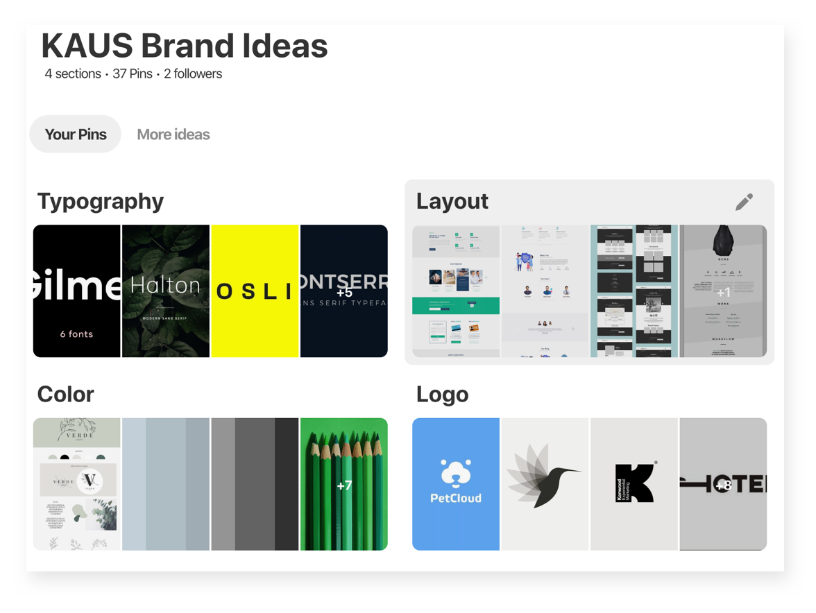
Mood Board: After synthesizing all my research findings, I went to find inspiration for how I would shape Kaus' brand. I wanted to create something that would appeal to both their loyal consumers and the new age tech savvy millennial crowd.
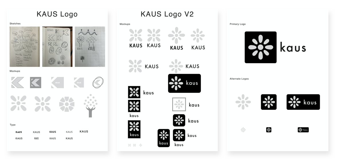
Logo: I wanted to approach the logo in the same way. I started thinking about concepts for a text based logo and symbol based logo and just played around with ideas until I landed on one. The final logo features multiple ovals surrounding a circle in middle. The ovals represent people and circle represent the head of each of them. This represents Kaus' commitment to foster a family environment and the diversity of its members.
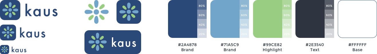
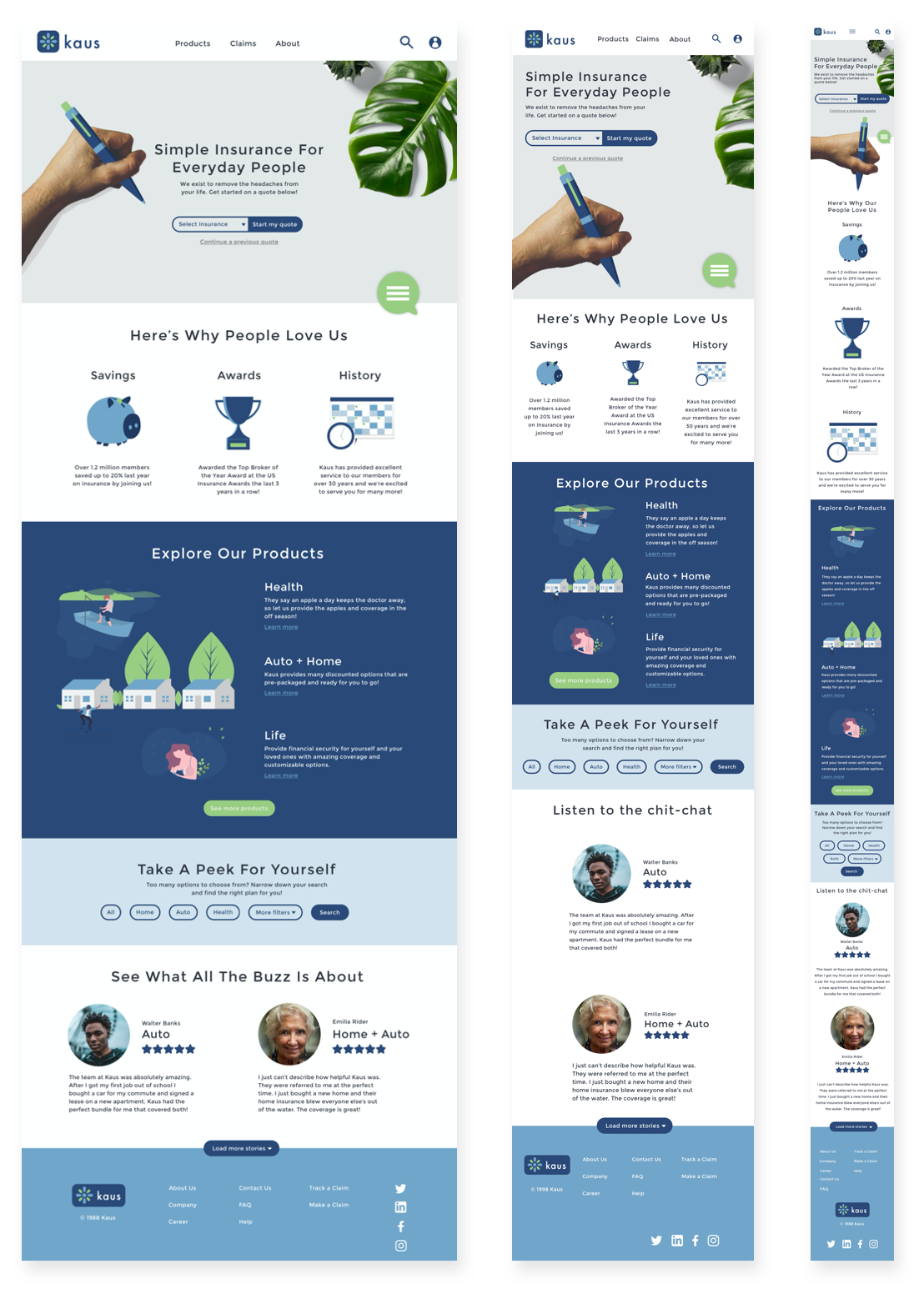
UI Kit: The decisions behind putting together this UI Kit are based on empathizing with our users. Designing this with Rachel Evans in mind, we wanted the site to be approachable, reliable and intuitive. The blue and greens will help provide a sense of safety and security to our users. The mixture of illustration style with photography is the perfect blend of staple design patterns that exist on most sites and new design trends that appeal to a younger audience.

Primary Logo Alternate Logos Color Palette
Typography
Heading 1 Heading 2
Montserrat Regular 46px Montserrat Regular 40px
Subheading 1 Subheading 2
Montserrat Regular 36px Montserrat Regular 30px
Body Copy 1 Body Copy 2
Montserrat Regular 18px Montserrat Regular 16px
Heading 3
Montserrat Regular 40px
Subheading 3
Montserrat Regular 21px
Body Copy 3
Montserrat Regular 14px
Static Button
Hover + Click Button


Button
Button
Button
Button
Icons
UI Elements


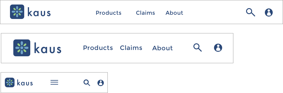
Headers
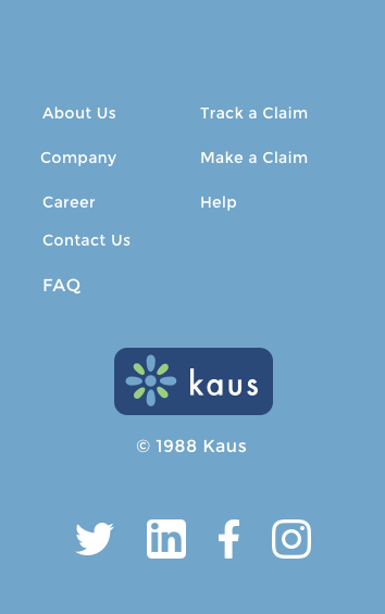
Footers


Responsive Designs: I compiled all the foundations created from the logo and UI Kit into a fully responsive design for Kaus
Iteration and Implementation
Hi-fi Prototype: With all the visual edits I made since the lo-fi prototype, I wanted to make sure the site was still usable. To confirm this, I conducted a usability test to confirm/deny my assumptions.
Usability Test: These tests gave great insight into the usability of the product. Using the Hi-fi prototypes, I wanted users to complete three separate tasks. I would explain each task to them, observe and record (with their permission) their interaction with the product and ask follow up questions to gain further insight.
Participants:
- Richard, 36, Clergyman
- Joy, 30, Executive Assistant
- Angel, 28, CPR Instructor
- Sasha, 28, Program Manager
Tasks:
- Use chat feature to get a quote re-emailed to you
- Locate page with bundle options for auto, home and health insurance
- Start and purchase a quote for auto insurance
Summary: The testers gave insightful feedback which led to the solving for aesthetic of the chat feature which was hard to locate and the way the filter function was supposed to behave. There was particular confusion around task 2 which caused me to iterate once more and adjust the design based on feedback.

Summary
This project was equally challenging as it was fun!
My greatest challenge was taking my synthesized research and turning into actionable steps to creating an amazing visual representation of what users are looking for in an insurance company and website. The key was to use a high level overview of my research findings and user persona to help lead me and inform my design decisions.
I'm excited to see how I continue to grow with each project and further my abilities to solve design problems in a creative and empathetic way!