Worked on multiple projects as a coherence effort across all of M365 Admin Center
Background
- Contract Duration: 2 months
- Role: Product Designer
- Tools: Figma, M365 Admin Center
- Partners: Program Managers, Designers, UX Researcher, Software Developers
The Microsoft 365 Admin Center enables businesses to manage applications, services, data, devices, and users across their Microsoft 365 services. During my time here I worked on three main projects: Message Center Weekly Digest Email Template, Admin Feedback View and My Feedback Portal.
Message Center Weekly Digest Email Template
The weekly digest email is a compilation of emails that IT admins are subscribed to. Microsoft decided to revamp the email design in an effort to have more effective communication and align the email's design with the rest of M365 Admin Center communication.
Goals:
- Update logos, images and links
- Rearrange content to reflect a hierarchy of importance
- Deliver more value in the weekly digest
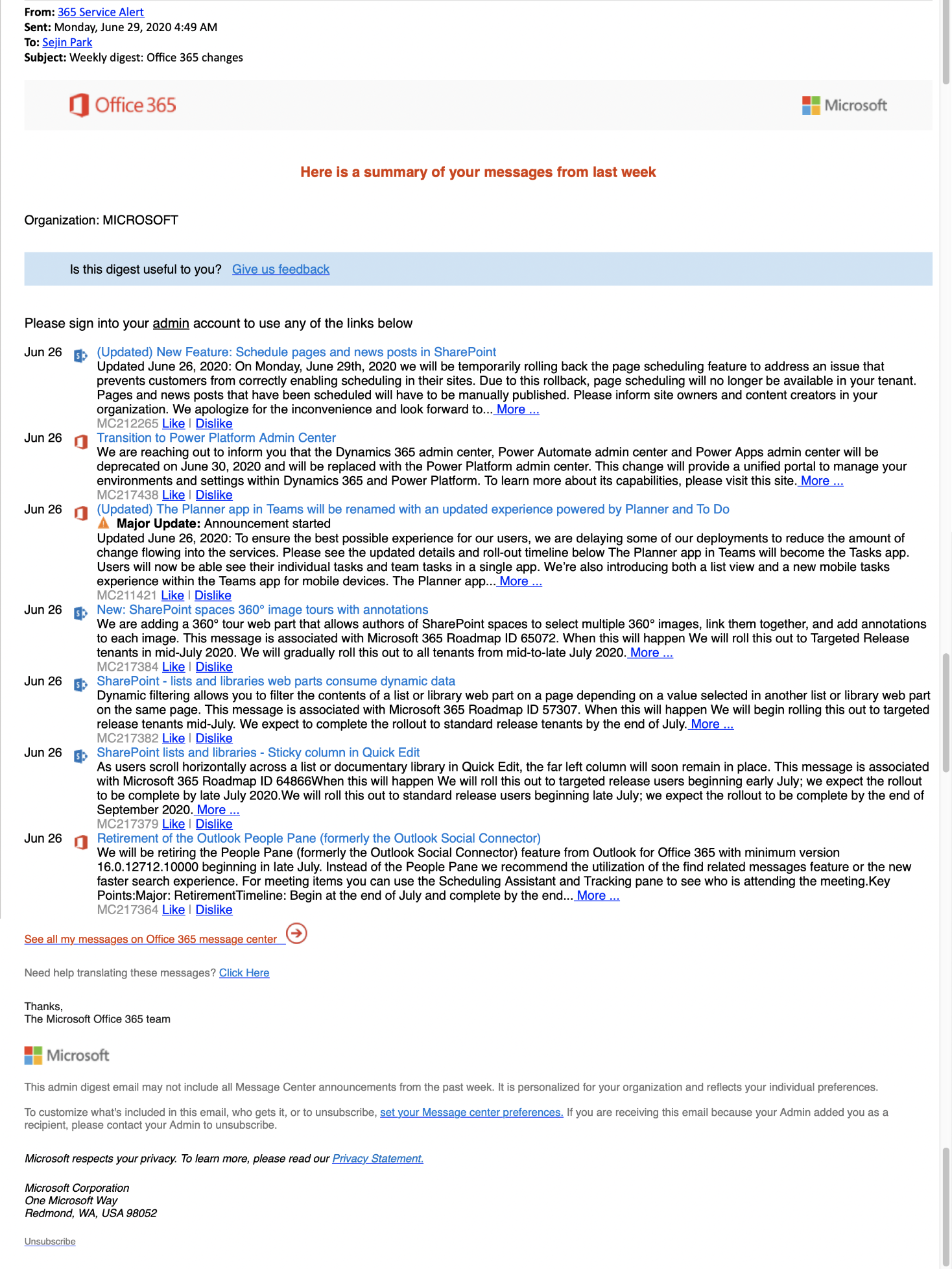
Flash Feedback Sessions: Our UX Researcher scheduled flash feedback sessions where she invited six microsoft IT admins to provide feedback on the current email template. Here are some findings she provided to the team:
- Customers want to see high priority items first; all other messages are secondary
- Customers want to see messages organized by priority so they spend less time scanning the email
- Customers find no value in the "like/dislike" buttons or date of the message
- Customers find it difficult to scan the email for important messages because there's so much text
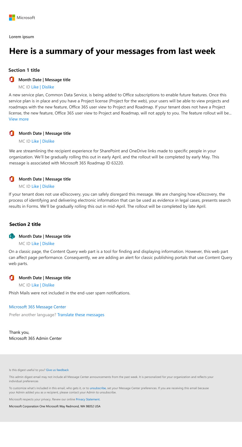
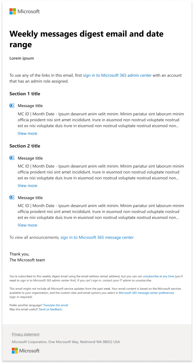
Solution: We implemented a few changes based on what we heard from consumers:
- Implemented a type hierarchy to visually create sections in the email
- Removed "like/dislike" functionality as devs confirmed that the action was outdated and led to a non-actionable data collection form
- Increased the vertical spacing so as to make the email more scannable
- Created priority sections and brought relevant, higher priority items to the top of the email
- Deprioritized MCID and date as this information is not as useful to the users as the content of the message and the product it pertains to
Current Template
Version 1 Final Version
Admin Feedback View
When feedback on Microsoft products are submitted by end-users, the business's IT admins are able to view the feedback in the Admin Center. The feedback is viewed in a list form, with many filter and sorting options available and a detail pane for every piece of feedback. Microsoft aimed present the information in a more holistic manner.
Goals:
- Create pattern for marking feedback as deleted
- Create pattern for displaying survey questions, answers and answers chosen
- Add descriptor text under the title
- Add new options for exporting the feedback list
Solution: Based on communication with the Program Manager, I implemented the following changes:
- Disabled checkbox pattern for viewing survey questions, answers and answers chosen
- Used a disabled state for marking feedback as deleted
- Added descriptor text under title
- Added two different export options for the feedback list (CSV & Zip)
"Delete Feedback" journey
Feedback details panel
My Feedback Portal
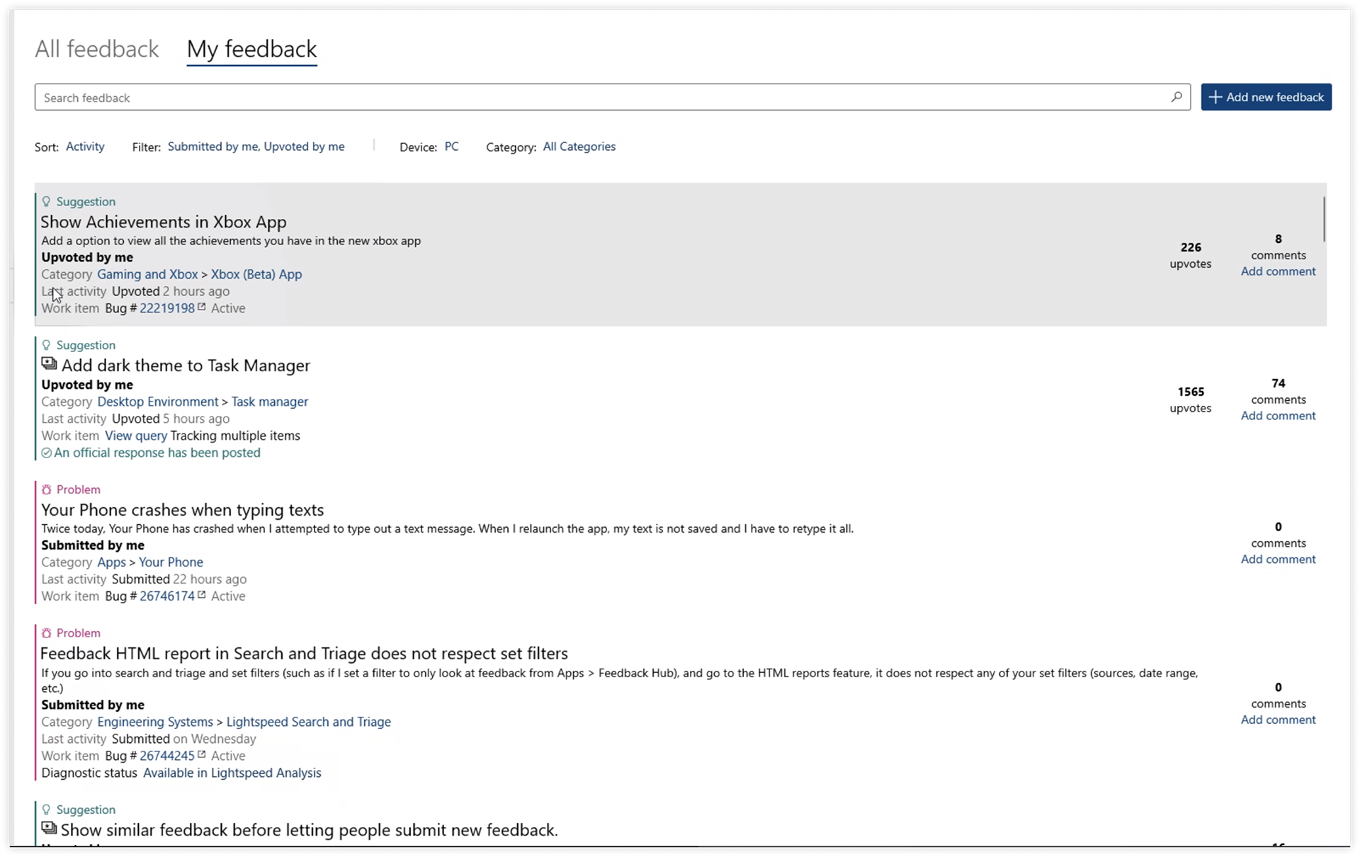
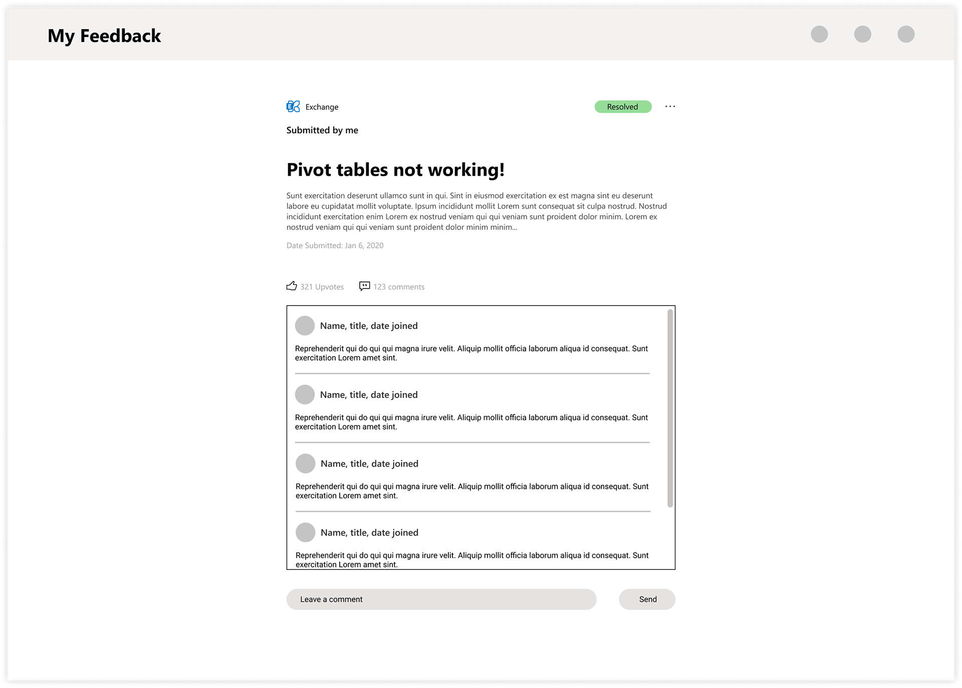
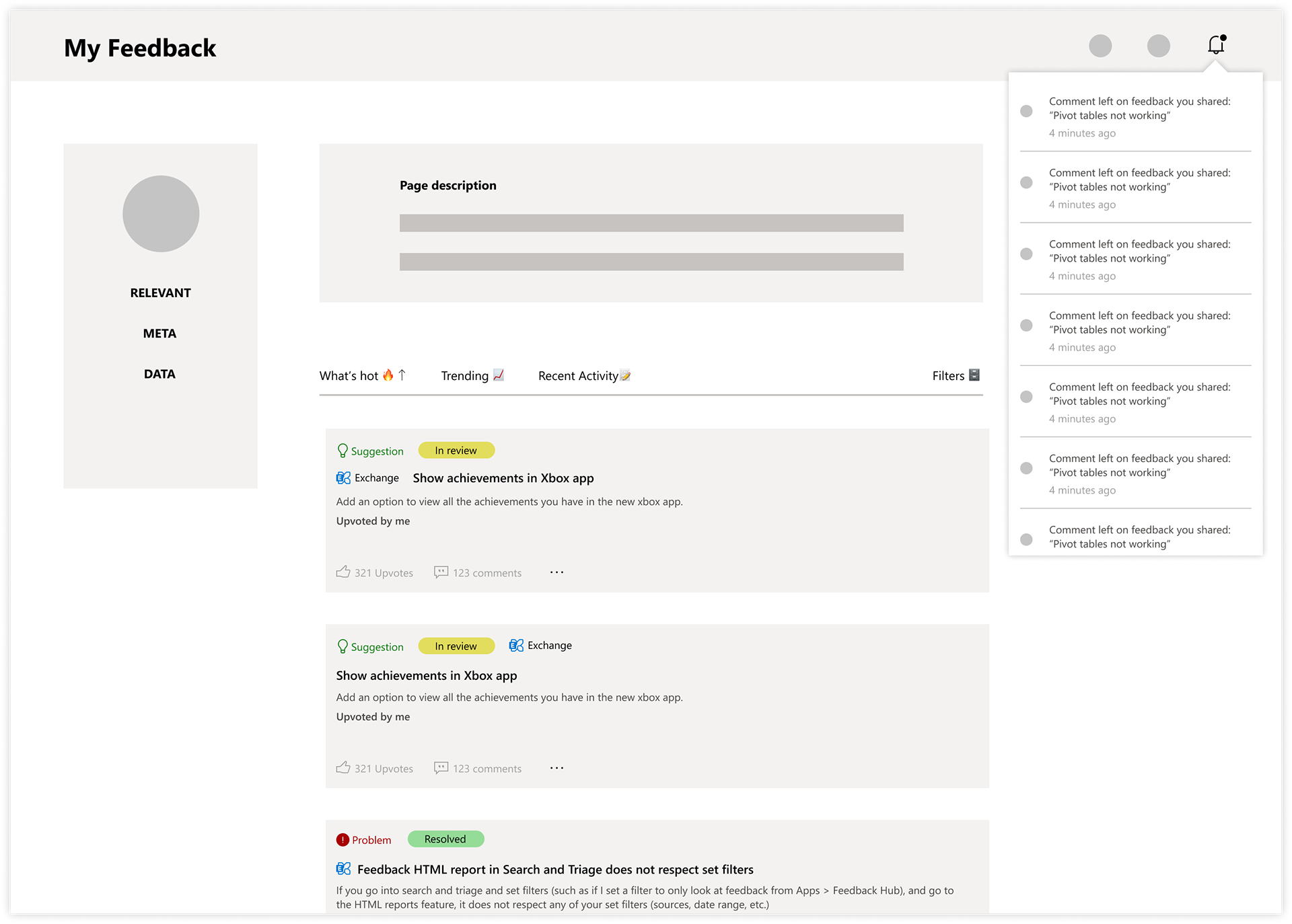
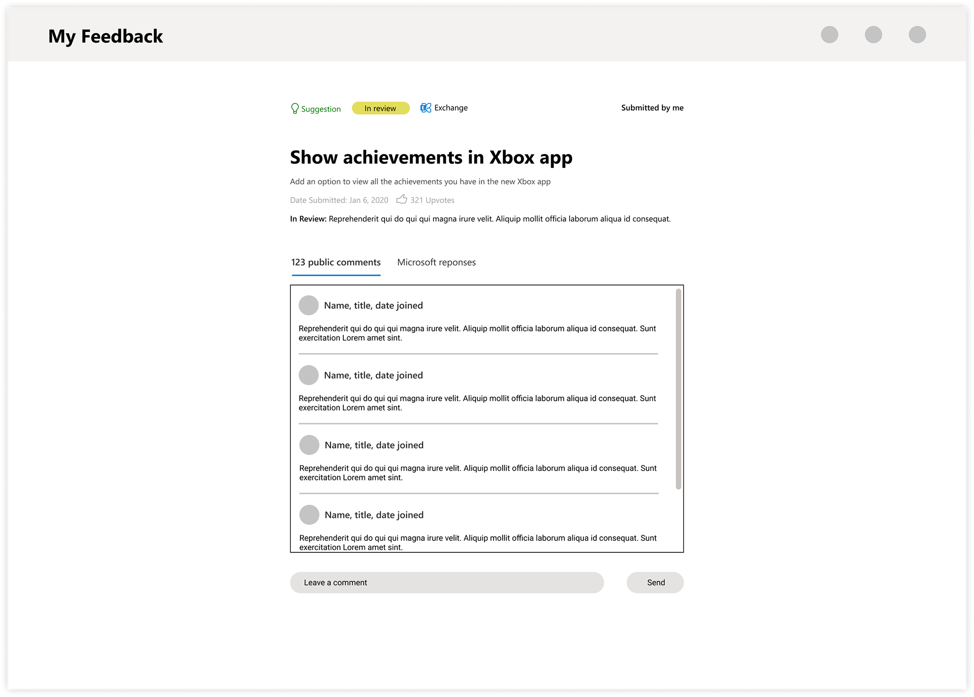
All the core Office apps have a similar experience for collecting feedback. There are two main backend platforms where the feedback goes; OCV Feedback and Feedback Hub. Feedback Hub features upvoting, commenting on feedback and other features similar to Reddit. As part of the trend towards coherency for Microsoft systems and processes, our team was tasked with creating a brand new web portal where all feedback goes to a single repository. in Phase 1 of My Feedback, the main objective would be to allow the users to view feedback they've interacted with, their own feedback and see if Microsoft had responded to their feedback. Future phases would be more robust. Because I was only here a short time, I started the wireframing process while our researchers conducted internal and external surveys. Hopefully I get to see how it turns out in the near future!
Goals:
- Create tagging system for feedback
- Implement a modern and organized hierarchy of information
- Research social platform patterns
- Keep in mind Microsoft's power users and casual users who would be utilizing My Feedback portal
Solution: Since this was still very early on in the process, we based our wireframes on the existing patterns of OCV Feedback and Feedback Hub:
- Created a card pattern/list view for feedback submitted
- Created tagging system to identify what product the feedback is in reference to and status of the feedback
- Organized metadata on feedback cards as well as details page for all feedback
Feedback Hub View
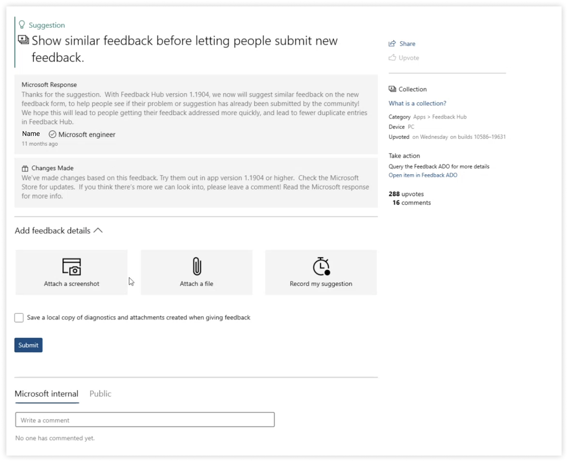
V1 My Feedback Portal
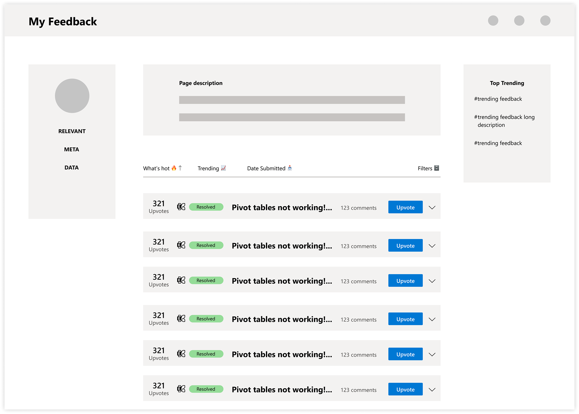

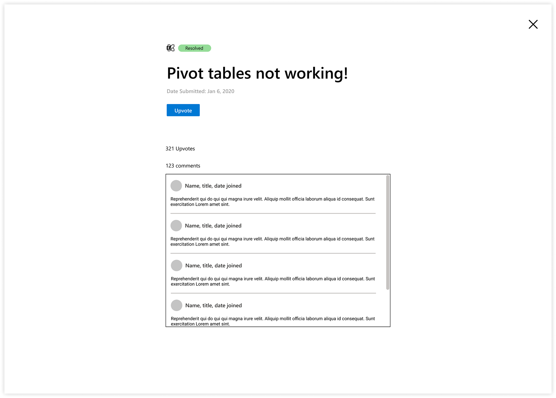
V2 My Feedback Portal
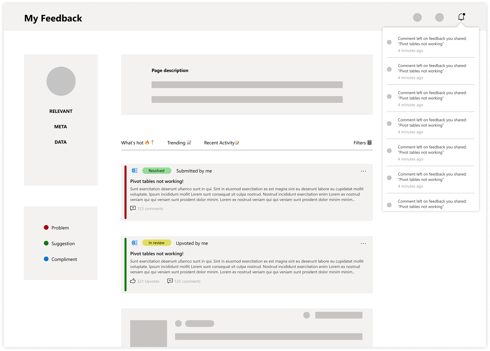
V3 My Feedback Portal
V4 My Feedback Portal
