End to end design of the Booku app, a social network for book readers
Background
- Project Duration: 2.5 weeks/49 hours
- Role: UX/UI Designer and UX Researcher
- Tools: Figma
- Stakeholder: Booku Executives (hypothetical)
Booku is an app for book lovers that will help users track everything they own, books they have
read, what they will read next, and also everything they have loved so far.
read, what they will read next, and also everything they have loved so far.
Brief
Booku has started collecting data on popular books. Inspired by goodreads.com, Booku wants to
give a more user-centric approach to their app, adding features and flows that make it delightful
for people to use. They want to use the full potential that a mobile app has, such as utilizing the camera to register books in a more automated way via optical character recognition (OCR), sending notifications to users to keep them engaged, tracking their progress on reads (potential gamification), etc.
Process
Research
Information Architecture
Interaction Design
Brand Design
UI Design
User Testing
Summary
Research
As someone who has recently rediscovered their love for books, it was really exciting to ask people a few questions about how they're coming across their latest reads and how they track the books they want to read! Before speaking with people, I conducted some market research and a competitive analysis. This helped me see what kinds of patterns already exist across similar apps and also allowed me to see what strengths and weaknesses lie in similar companies. One thing that stuck out for me was how deeply people are aware of how they share book recommendations, how they track the books that they read and the different types of genres they read.
Interviews:
- Participant 1: Male, 36, Clergyman
- Participant 2: Male, 28, Student/Personal Assistant
- Participant 3: Male, 27, Technical Support Specialist
I really enjoyed engaging with seasoned book readers on their book sharing and tracking experiences with. I was able to hear some of the reasons they read and what kind of role the act of reading plays in their lives. The goal of the interviews was to understand why people read and some of the methods they use to either share book recommendations or track all the books they read and want to read. I also sent out a survey on my social networks that brought in 15 responses. I was surprised to see that 73% of all my participants strictly read paper books. This statistic stuck out to me because of the age of technology we're in, I would've expected more people to use Kindles or a similar service.
User Persona:
Carlos was born out of the feedback that I received from the surveys and interviews that I conducted. Carlos has held on to his reading habits throughout his life and he really wants a more efficient way of looking up recommendations from friends because all the photo texts are eating up his data! Carlos will be one of the foundations that helps lead Booku's design.
Empathy Map:
This empathy map allowed us to peer into Carlos' everyday activities. This further helps us make our design solutions more specific so as to address the dilemma Carlos faces.
Information Architecture
Sitemap:
Carlos' persona along with the empathy map helped create Booku's sitemap. I organized the pages in a logical manner so as to optimize Carlos' user experience journey.
Sketches:
I sketched the homepage layout and thought of ways to display the content based on the feedback I received during interviews. This was a fun process because there were so many possibilities on how to make it an engaging UI!
Interaction Design
User & Task Flows:
The flows I created were based patterns observed during the research phase. These interactions also came out of consideration of current user flows on similar existing apps.
Mid-fidelity Wireframes & Prototype:
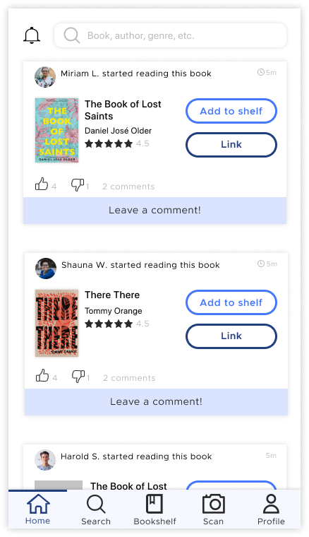
These wireframes were created upon reviewing my sketches and task & user flows. I had to keep in mind the social aspect that Booku wanted to have. It would not only be an app for book lovers to track the books they're reading but also to engage with other book lovers, authors and the book reading community at large. I turned the wireframe into a prototype to conduct some early adhoc testing with colleagues and potential users.
Brand Design
Logo:
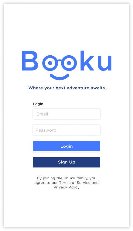
I tackled the Booku logo identity as well! The challenge was creating a logo that was visually approachable and creative. I came up with the idea of using the name as the logo, but also adding a symbol aspect to it as well. I wanted to make the logo playful yet modern at the same time, which is why I decided to keep the color scheme simple. The two blue used in different tints allows for consistency but also makes the app feel secure and approachable. I chose to make the two o's resemble glasses and a smiley face because it reminded me of myself. My mom worked full time and went to school in the evenings so as a kid who wore glasses at a very early age (since Kindergarten!), I spent many hours in the library while my was in her class and I would play video games, do homework or read one of the books in the library. I felt it important to tap into the untethered curiosity we have as children and mimic that same sense wonder in the logo.
UI Kit:
When creating the elements for the UI Kit, I wanted to keep it simple as possible for possible developers to digest the content with ease. I also wanted the app to remain intuitive with recognizable patterns.
Logo:
Typography
Icons
*Icons provided by freepik.com
Buttons
Static:
Navigation
On click:
Search
Cards
Images


UI Designs
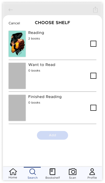
I compiled the elements in the UI Kit and applied it to the preliminary final UI designs for Booku. I started by creating some of the keys screens.


Usability Testing
Hi-fidelity Prototype:
I conducted user testing with a hi-fi prototype I created based on feedback from the lo-fi prototype. I wanted to measure my design solutions and assumptions against a users actual experience using the Booku app.
User Tests:
These tests gave me insight into how usable the product is. Using the hi-fi prototypes, I wanted users to complete three separate tasks. I walked the users through each task and observed their interactions with the product and asked follow up questions to gain further insight. I also sent out the same test with follow up questions through a testing platform called Maze. I sent it out through my social networks and received seven responses.
Participants:
- Rich, 36, Clergyman
- Darnell, 41, Customer Service Representative
Tasks:
- Login to the Booku account and find the fiction genre page
- Find details on the book titled “Green” and Add it to the “Want to Read” list
- Search for a book titled “Green” and see where it is available for purchase
Feedback Summary:
Unfortunately, Darnell was having technical issues and was unable to finish the testing. He still left me with some feedback. Because of this, it was super helpful to have the feedback from the remote testers. I received very helpful feedback on the user experience. One common thing that came up was the sizing of the navigation bar. A lot of users felt it was much too large for an app. Another comment was that the "Add to Shelf" and "Link" buttons seemed to be too focal and users instinctively clicked on it because it was the first thing that grabbed their attention. They thought it should be less of a focal point in the app.
Iteration
Based on feedback in the user tests, I iterated on the designs I made for Booku. You can also find an updated prototype here.
Summary
This project was so much fun!
My greatest challenge was organizing all the feedback throughout the interviews, surveys and user tests in a way that was manageable. Because most, if not all, of the participants were avid readers, they had a lot to say! The key was to identify patterns in the feedback and use those as a high level overview of all the feedback I received.
Were I to continue working on this, I would look to dive deeper into the social aspect of the app. Where would the recommendations from other users be located? Are there livestream events with popular authors? Is there a chat section? The possibilities are endless for this app and as Darnell said it best, currently, there aren't many platforms where book lovers can congregate and share their stories with each other.
